Is Photojournalism Art?
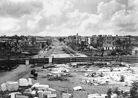
Photo by: George N. Barnard
Image Source: https://www.wesleyan.edu/dac/collection/photographs-before-1900.html
Year Created: 1864
Depth of Field: In my opinion, the most obvious principle used is maximum depth of field. This image portrays a large area and/or landscape that seems to just continue on and on forever. The subjects in the foreground of the photo create that sense of depth without taking away from the many additional subjects in the background.
What feelings does the image create?: This photo is made up of so many different things, yet somehow it still feels empty at first glance. It especially feels empty once you've given it a thorough breakdown. It's like a ghost town, and the image leaves it up to the inanimate objects to convey the vacantness of this place which can be very unsettling and eery.
Is the image in black & white or color?: The use of black & white here is most definitely appropriate. It's almost as if even in real life, this scene would look just as dull and depressing. It not only allows the viewer to infer that there is something negative attached to this photo, but also that this photo is old and was taken a long time ago.
Why did I choose the image?: I chose this image because I thought it was interesting to see a photo taken in a war-setting without people in it, too. Usually, images taken during the war include soldiers or even civilians—and you would think that the people in this type of image are a crucial component to delivering the true pain and emotion. However, I think that this photo is able to do that regardless of the fact that it is lacking people as its subjects.

Photo by: Alfred Stieglitz
Image Source: https://beckchris.com/visual-arts/best-photos-of-all-time-the-critics-picks/best-photography-of-all-time-part-i-1826-1945/
Year Created: 1903
Rule of Thirds: This image uses the rule of thirds more than just once. In the foreground, we can clearly see that there is a tree. It goes all the way from the bottom to the top of the photo, and since it is off to the right third of the photo, it hits both of those crash points on the right side. What I find very interesting is how the building in the background basically fills up the other two thirds of the photo, emphasizing that the tree utilizes the rule of thirds, as well as the fact that it is the main focal point of the photo.
Use of Shadows: Looking at the building in the background can be a bit confusing at first glance. Out of the two sides that we as the viewer can see, the left one is much darker than the right. This gives the image a great balance overall, because without the shadowed portion of the building, the tree would be one of the only subjects contrasting the lightness. As a result, the photo would be off balance.
Use of Lines: Similarly to the way that the rule of thirds was utilized here, this photo is very clearly a vertical image. The use of vertical lines with the trees and the building really elongate the photo and draw the viewer's eyes up and down. The lines are not all vertical, though. Towards the bottom of the image, there are benches going horizontally and at a slight angle. This small detail gives the photo just the right amount of variety to make the viewer's eyes wander all over and see the image in its entirety.
Why did I choose the image?: I chose this image because I loved how simple it is. It looks to me like a picture taken somewhere in New York City—like Central Park—as a bad snow storm is finally coming to an end. With such a tall building in the background, I would expect for there to be tons of people frantically trying to get somewhere, but instead this area is extremely calm and quiet as if its typical noise and chaos is being muffled by the soft snowfall.

Photo by: Patricia Carbine
Image Source: https://www.loc.gov/rr//print/coll/596_womphotoj.html
Year Created: 1957
Subject's Expression: The woman pictured here is named Charlotte Brooks. Without a doubt, her expression is the most important element to this image. It appears as though she is stuck in a well of some sort, but given the context of her bright and joyful smile as well as the camera that she's holding, we can infer that she went down there voluntarily to get a photo.
Contrast Appropriate: The contrast in this image is very well balanced. This is mainly due to the fact that it is in black & white as opposed to color. But in spite of that, the contrast of her light skin against the dark brick background helps to draw attention to Charlotte Brooks as the main subject. It also works nicely that the dark camera contrasts with the paleness of her hands. Without that, it could be difficult to know what she is holding and furthermore why she is holding it.
Obvious Main Subject: As I had previously mentioned in the "Contrast Appropriate" section, Charlotte Brooks is the main subject of this photo. I know this because she is in the center of the photo, surrounded by a plain background. As viewers, our eyes are naturally drawn to the brightest part of the photo which happens to be the woman's face and hands in this example.
Why did I choose the image?: I chose this image because it caught my attention. Compared to all of the other melancholy, black & white, boring images that showed up in my search, this one had more of a sense of light to it. I think I am generally more drawn to photos of people, but especially of just one person. She certainly stood out to me with her candid and natural smile!
Extra Credit Photo:

Photo by: Samantha Moran (me)
Taken on: 10/02/2024
Use of Lines: There are many lines to notice in this photo! The horizontal lines on the tool box (main subject) function to draw the viewer's eyes towards the lefthand side of the image where there are more lines pointing in all directions on the garage.
Use of Shadows: Another thing that the viewer's attention turns to after the tool box is the shadows seen on the garage door. This creates a nice sense of balance in the photo. Without the contrast from the shadow casted against the white garage door, the tool box would be much too heavy on the righthand side of the image.
Quality of Light: A key aspect to the use of shadows in this photo is the quality of light. The open garage door to the right allows natural side light to hit the tool box and cast a shadow to the left of it. The light on the right side is not too overpowering, though, due to the window on the left.


Comments
Post a Comment